A bold, new Era.
NAK Signature Rebrand
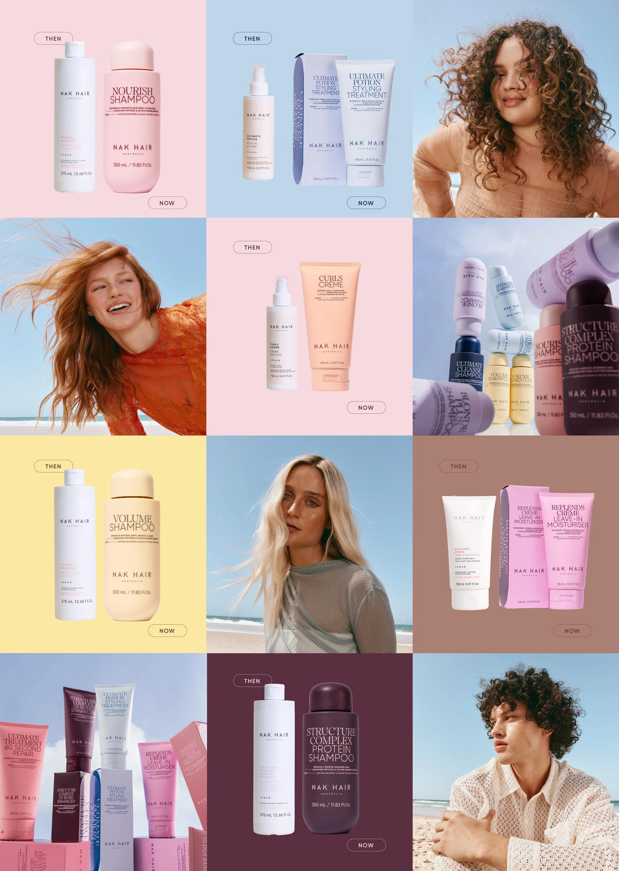
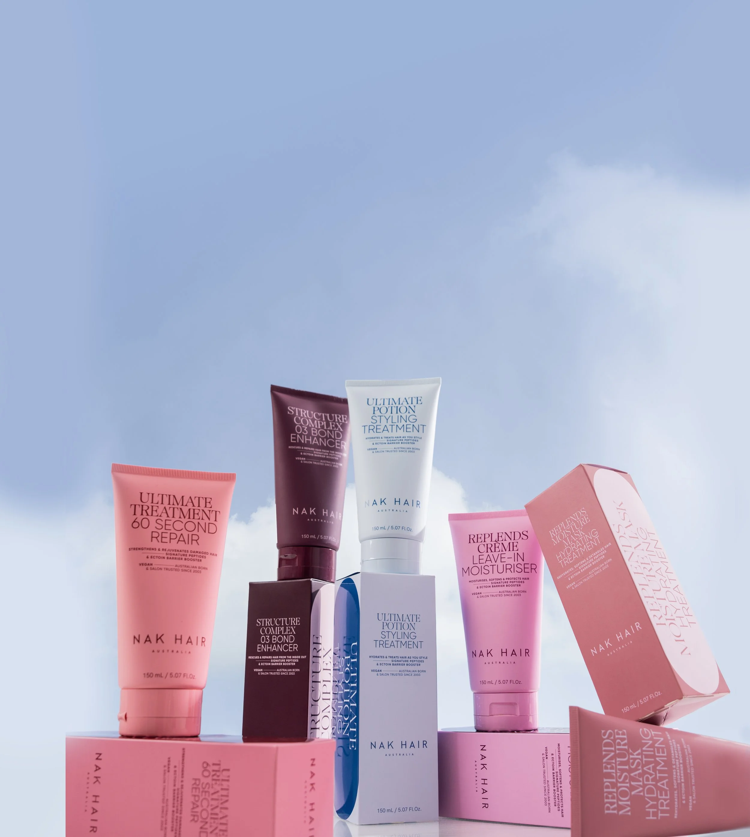
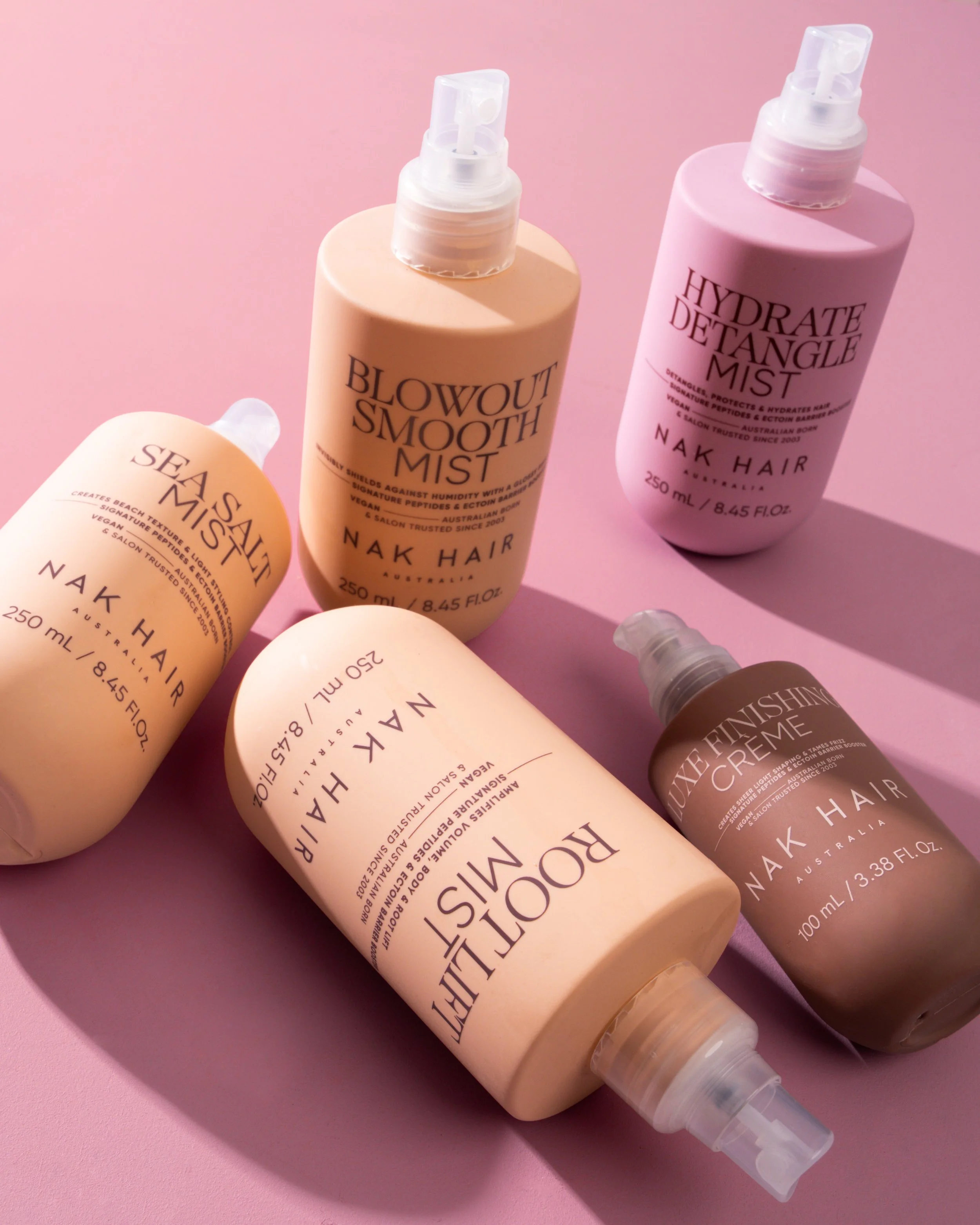
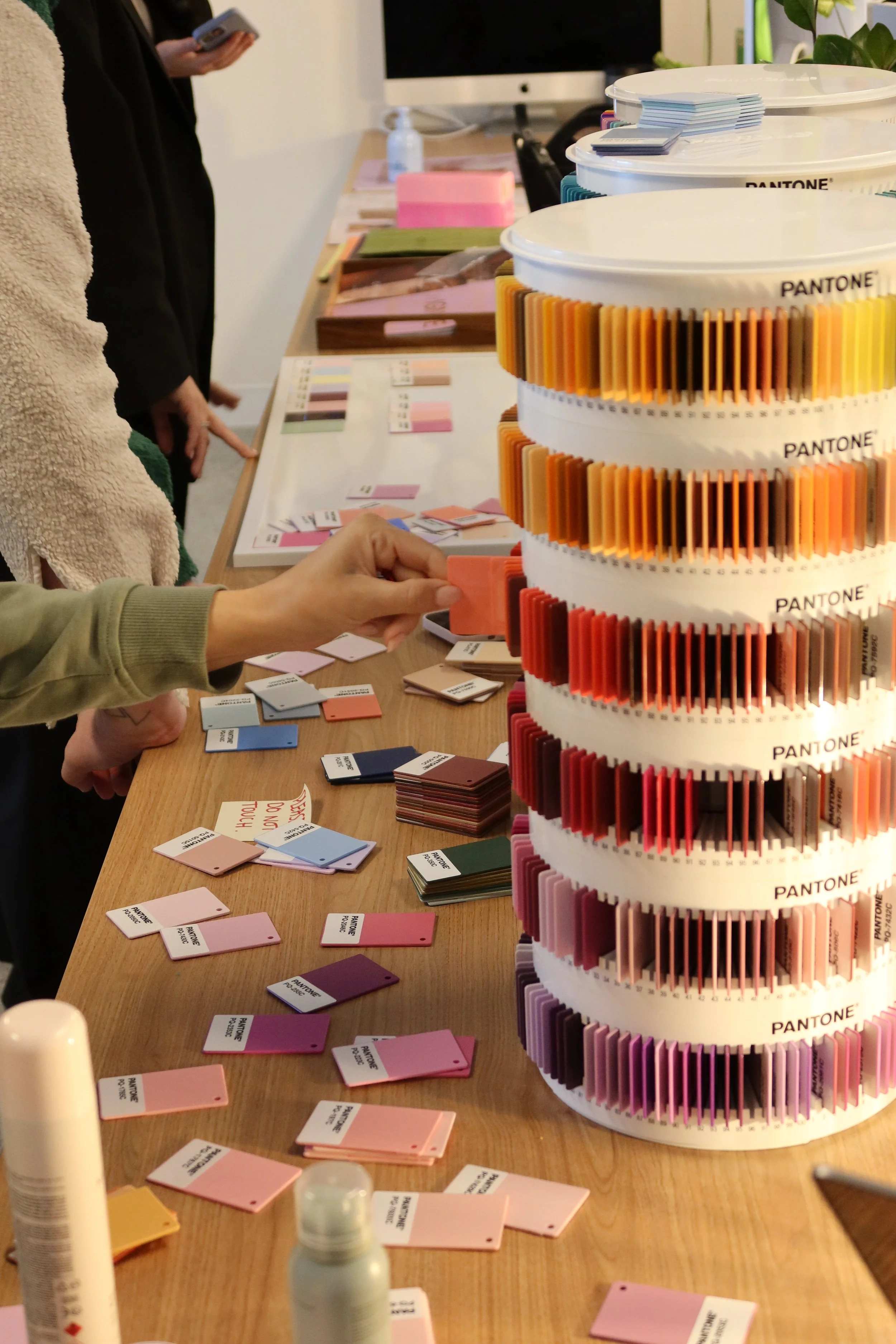
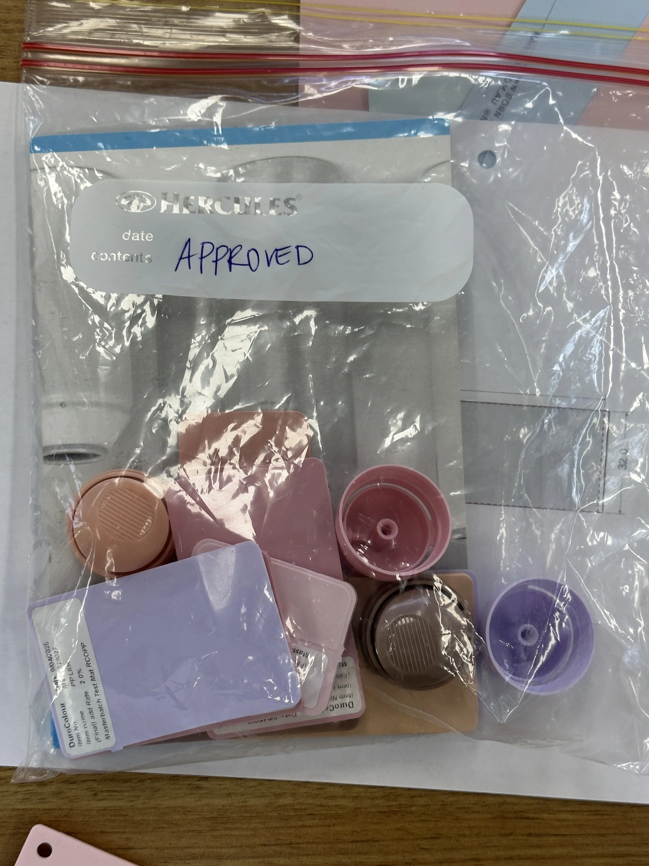
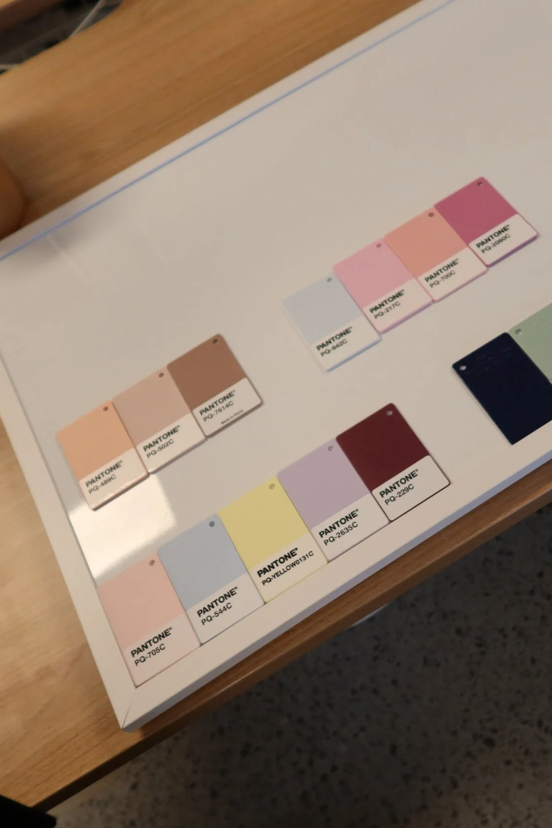
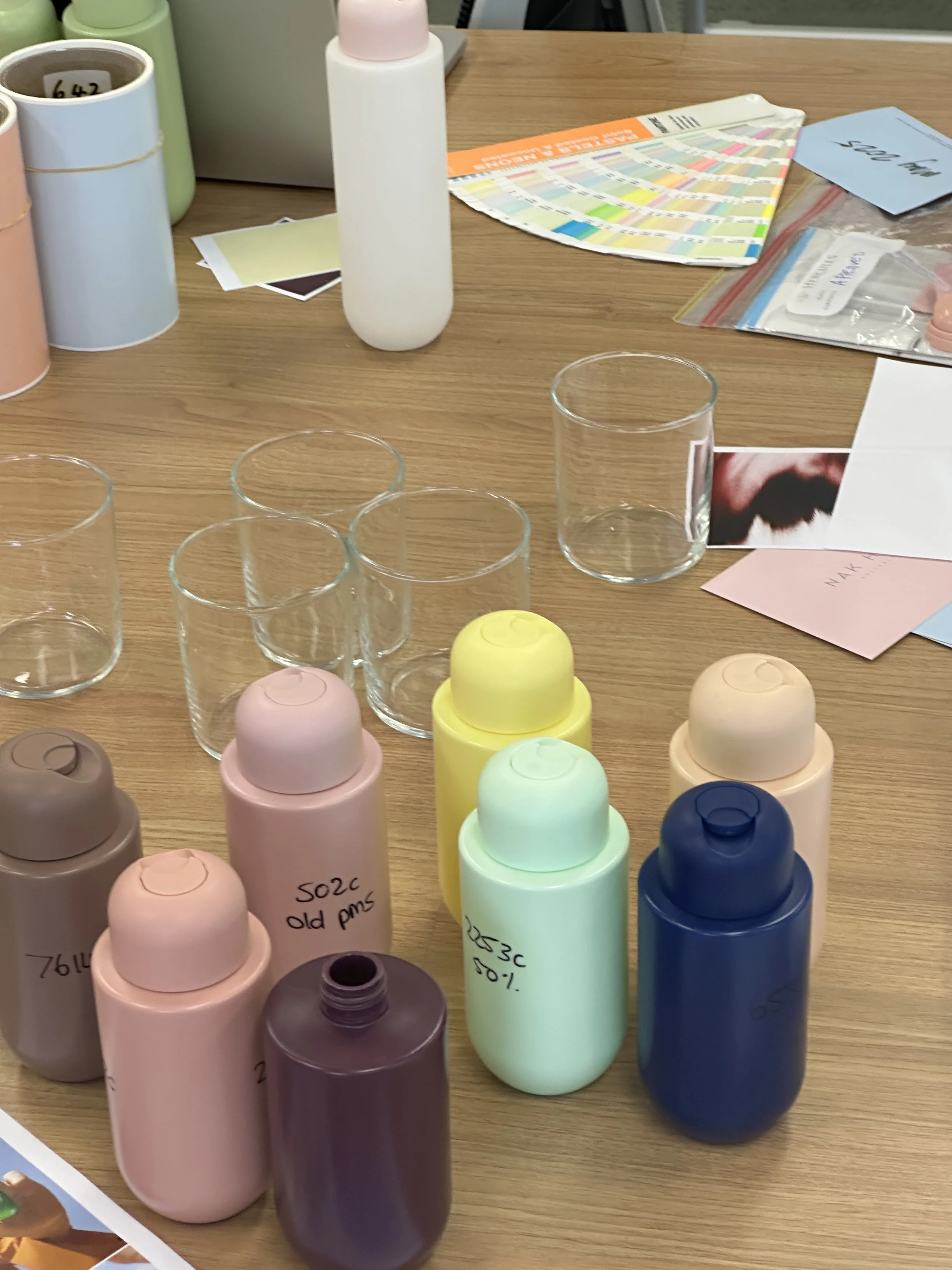
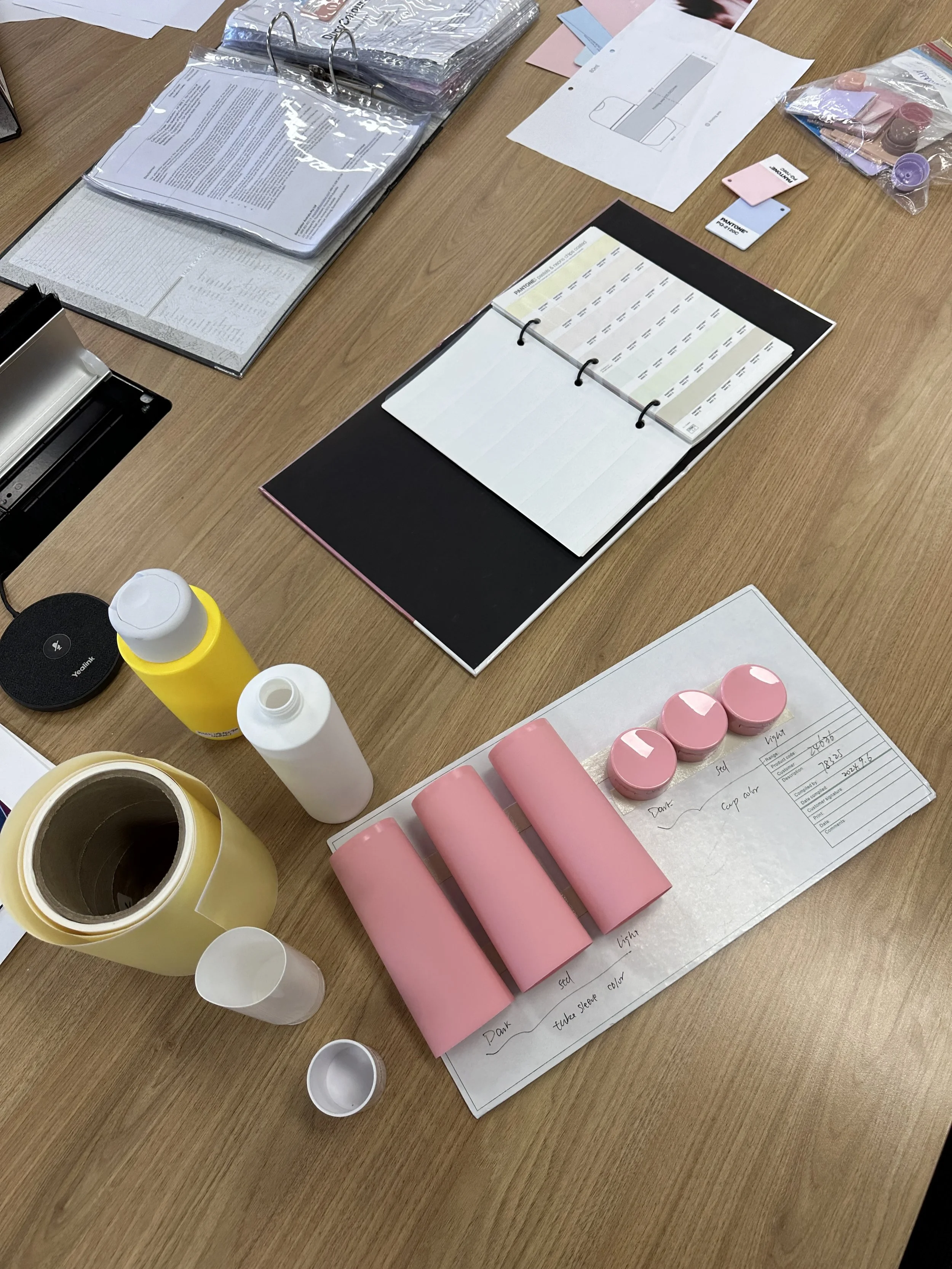
As part of NAK Hair’s senior creative team, I collaborated with fellow Senior Designer to evolve the Signature range across packaging and visual identity. My focus centred predominantly on colour strategy, evolving the brand’s recognisable palette into a more contemporary system that retained existing brand equity while creating stronger differentiation across the portfolio.
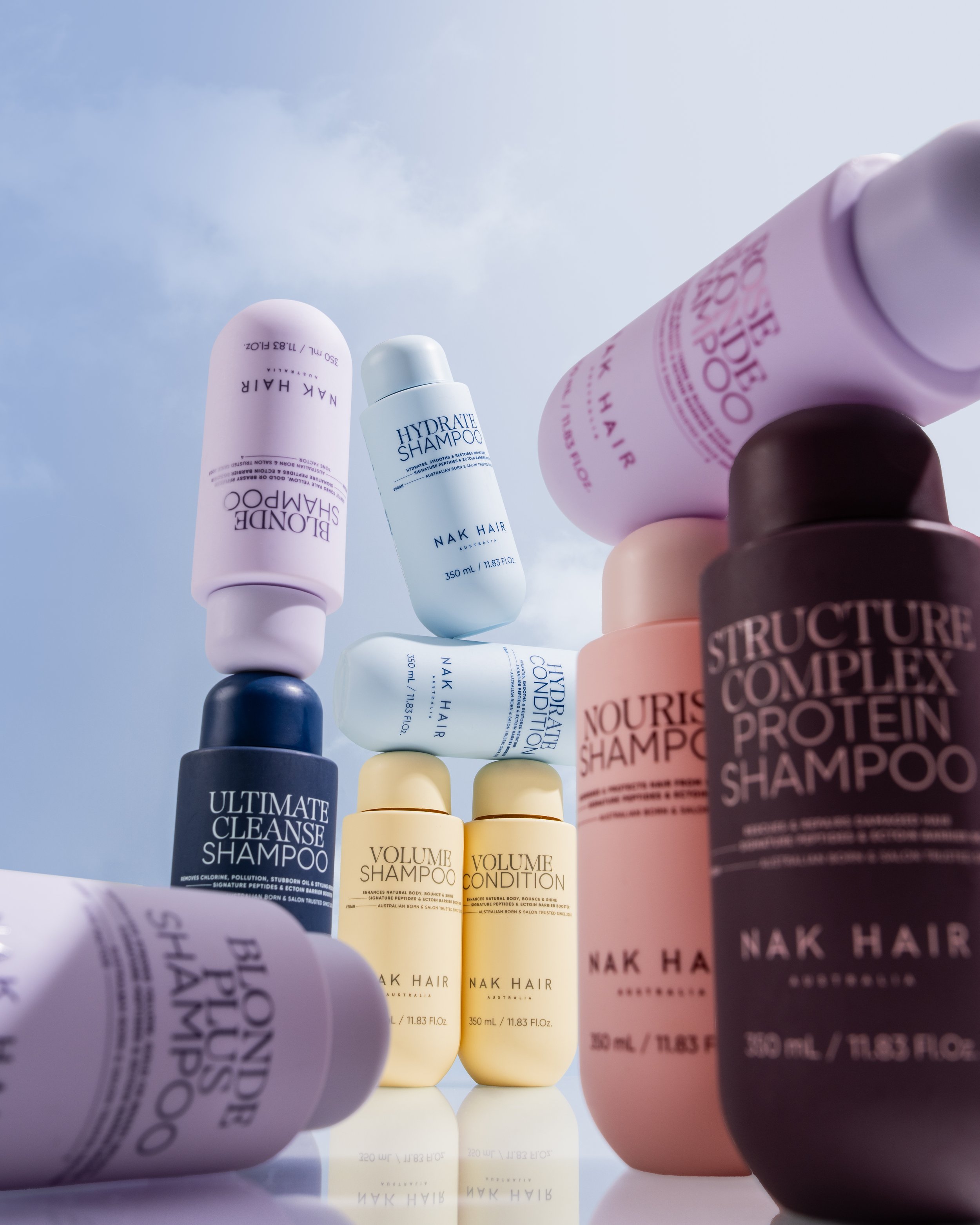
In response to customer feedback around product recognition, we introduced a more confident hierarchy of colour, scale and typography. Colour became an intuitive navigation device, while amplified product naming improved legibility and gave the range greater presence across shelf, salon and bathroom. The result is a bolder expression of Signature that feels distinctly new, yet unmistakably NAK Hair.
Australian born.
Made for the world.
Signature Campaign
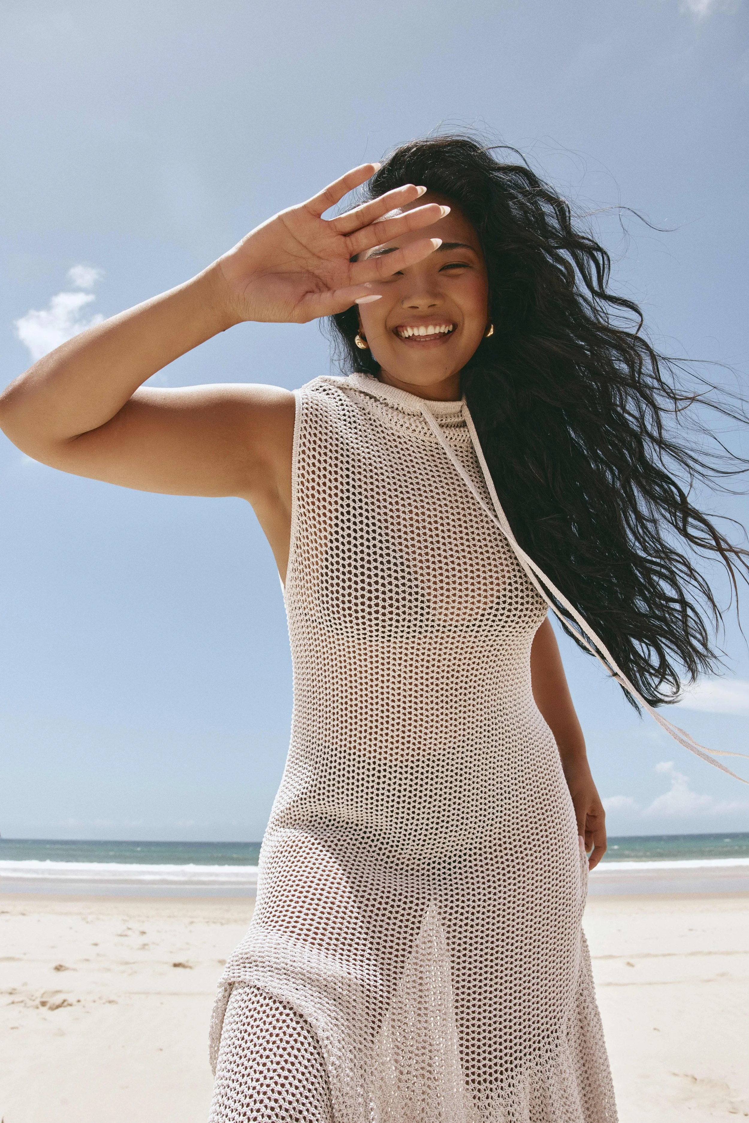
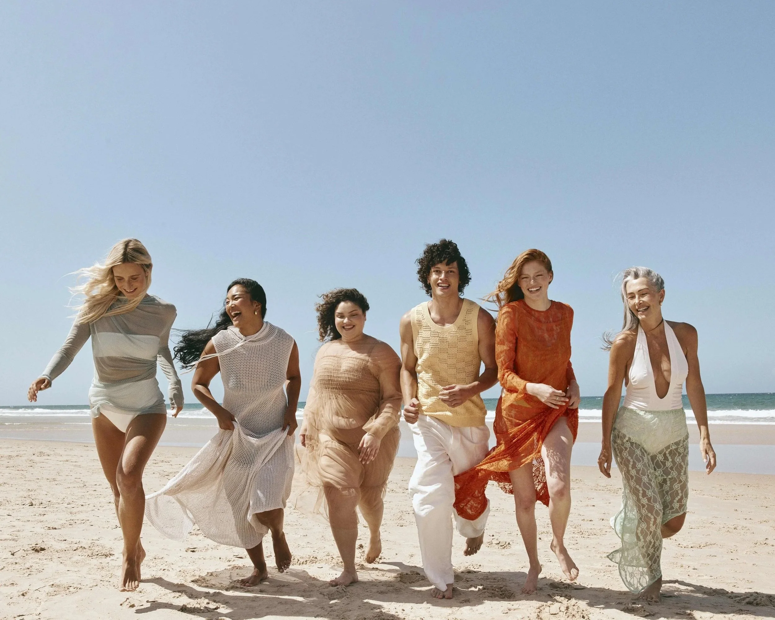
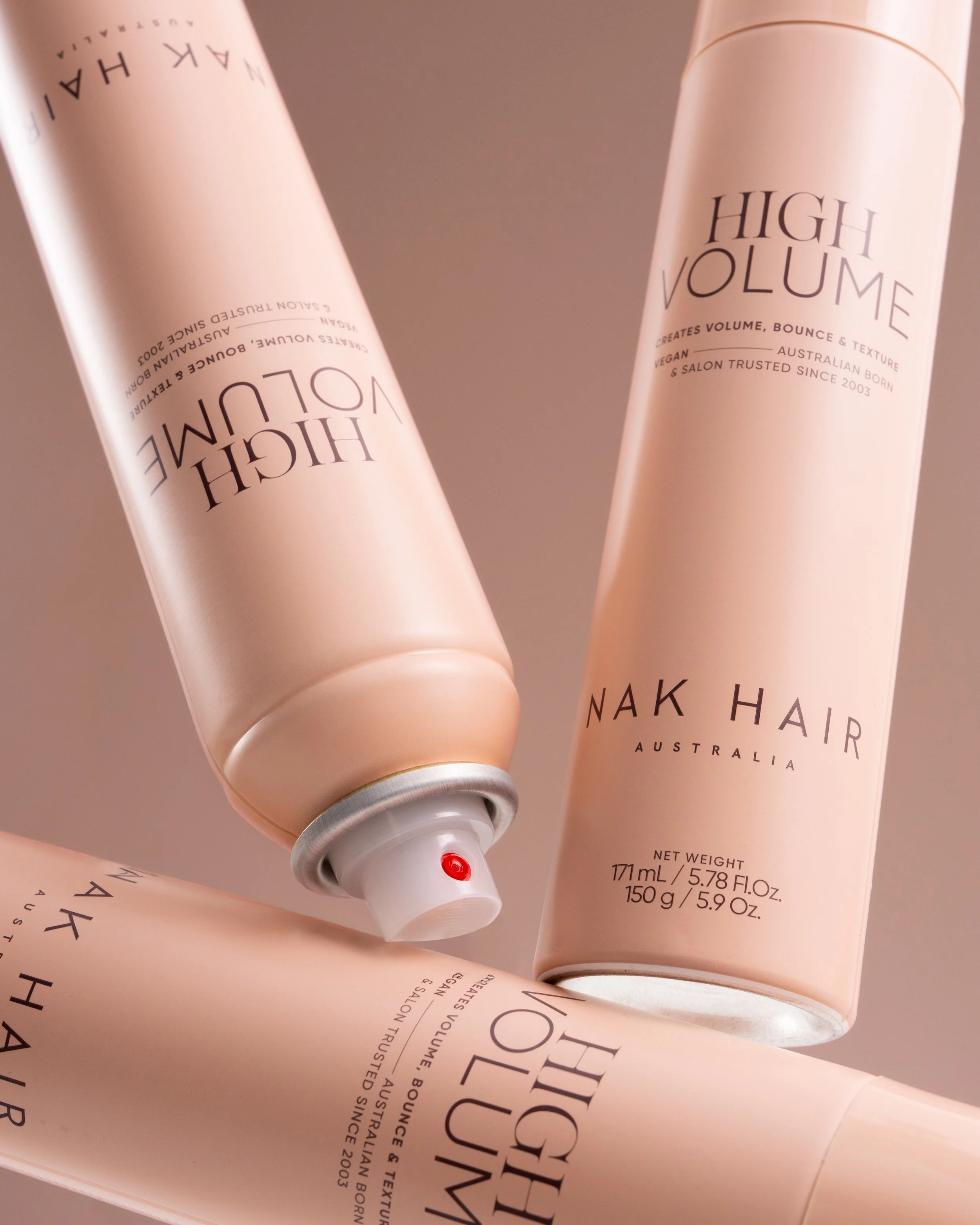
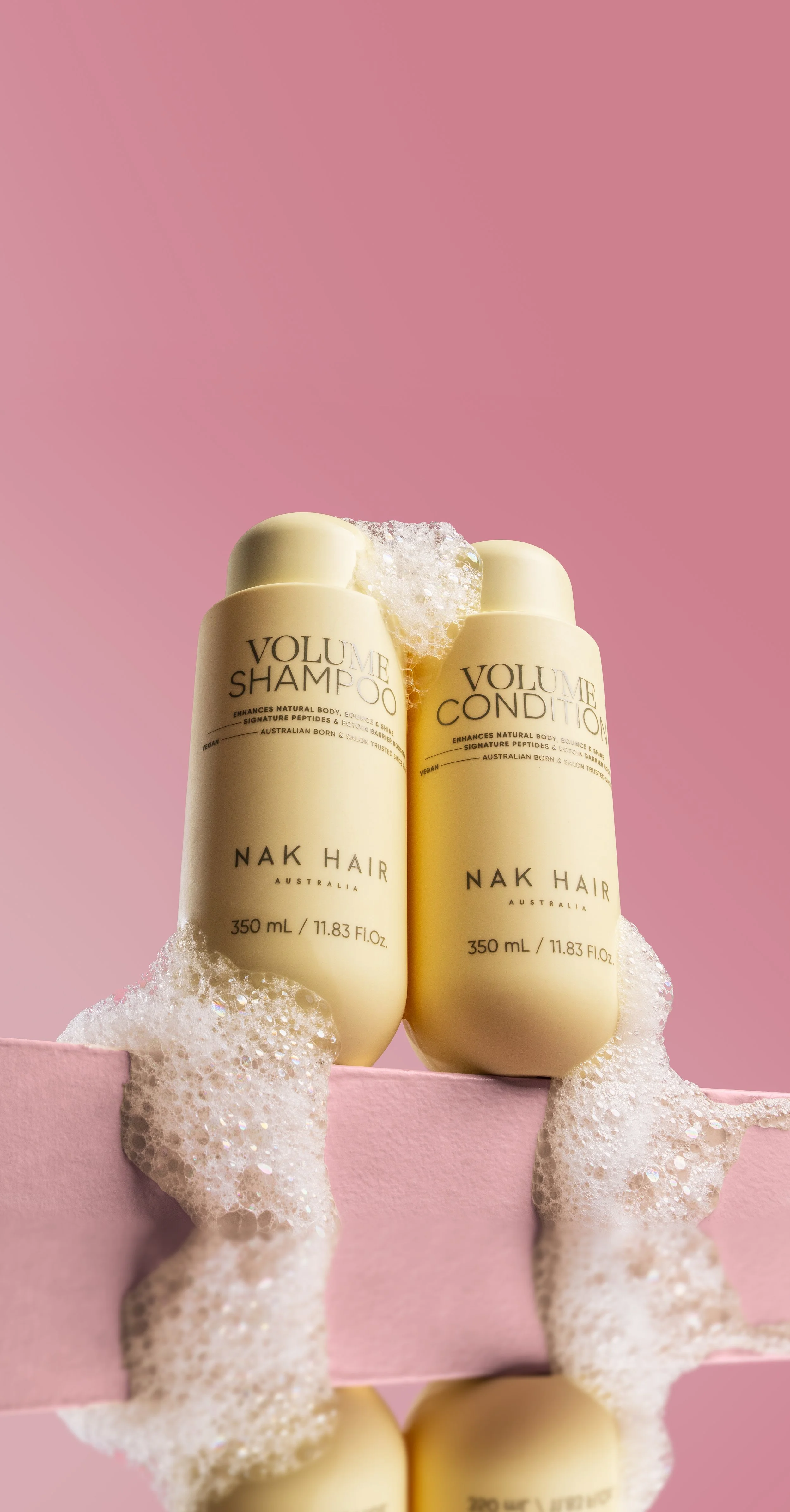
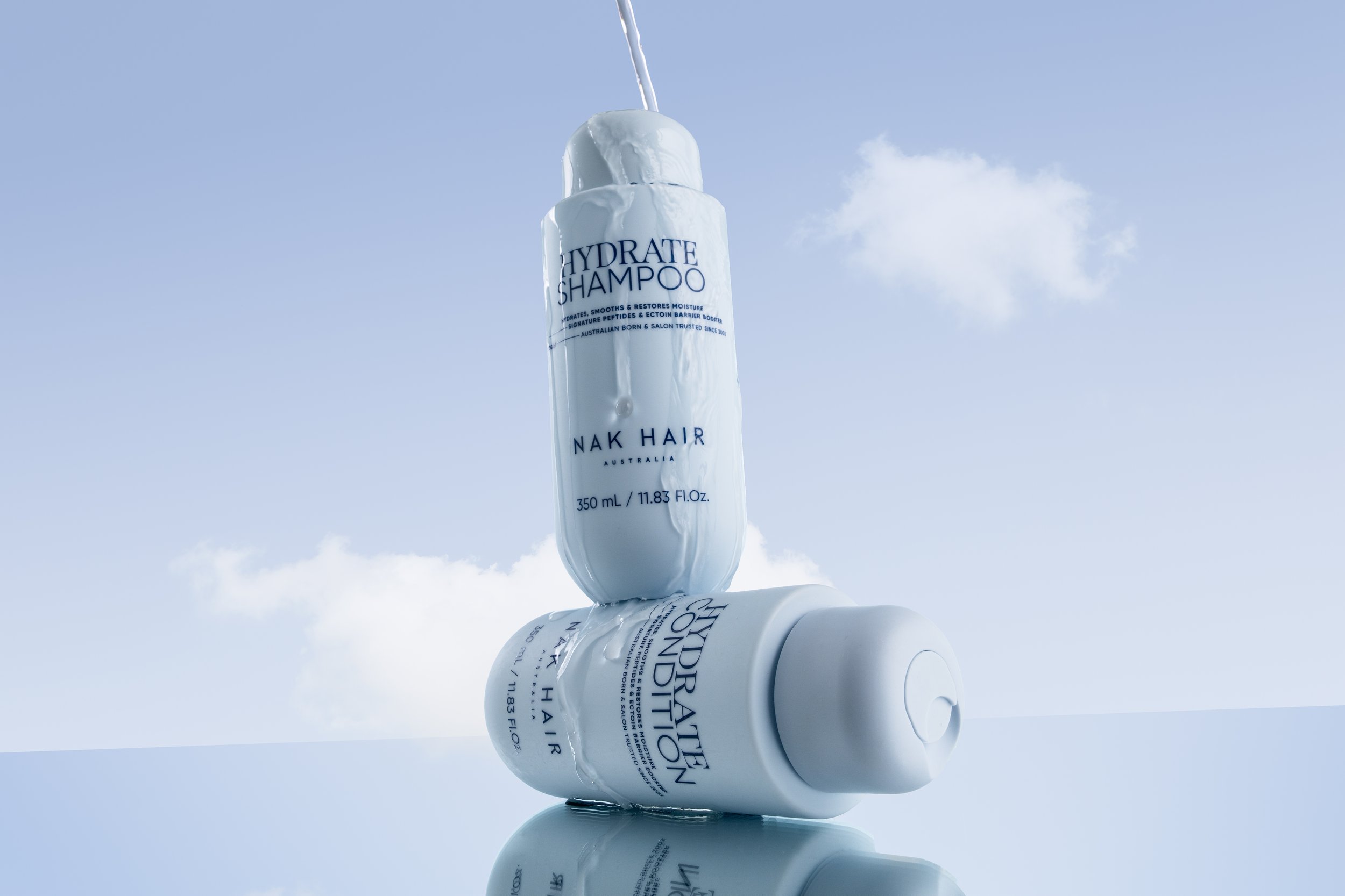
Alongside the packaging evolution, a new campaign was developed to introduce Signature’s refreshed look and feel. Working as part of the in-house creative team, I contributed to the campaign development and shoot preparation, helping shape the visual direction as the concept moved into production.
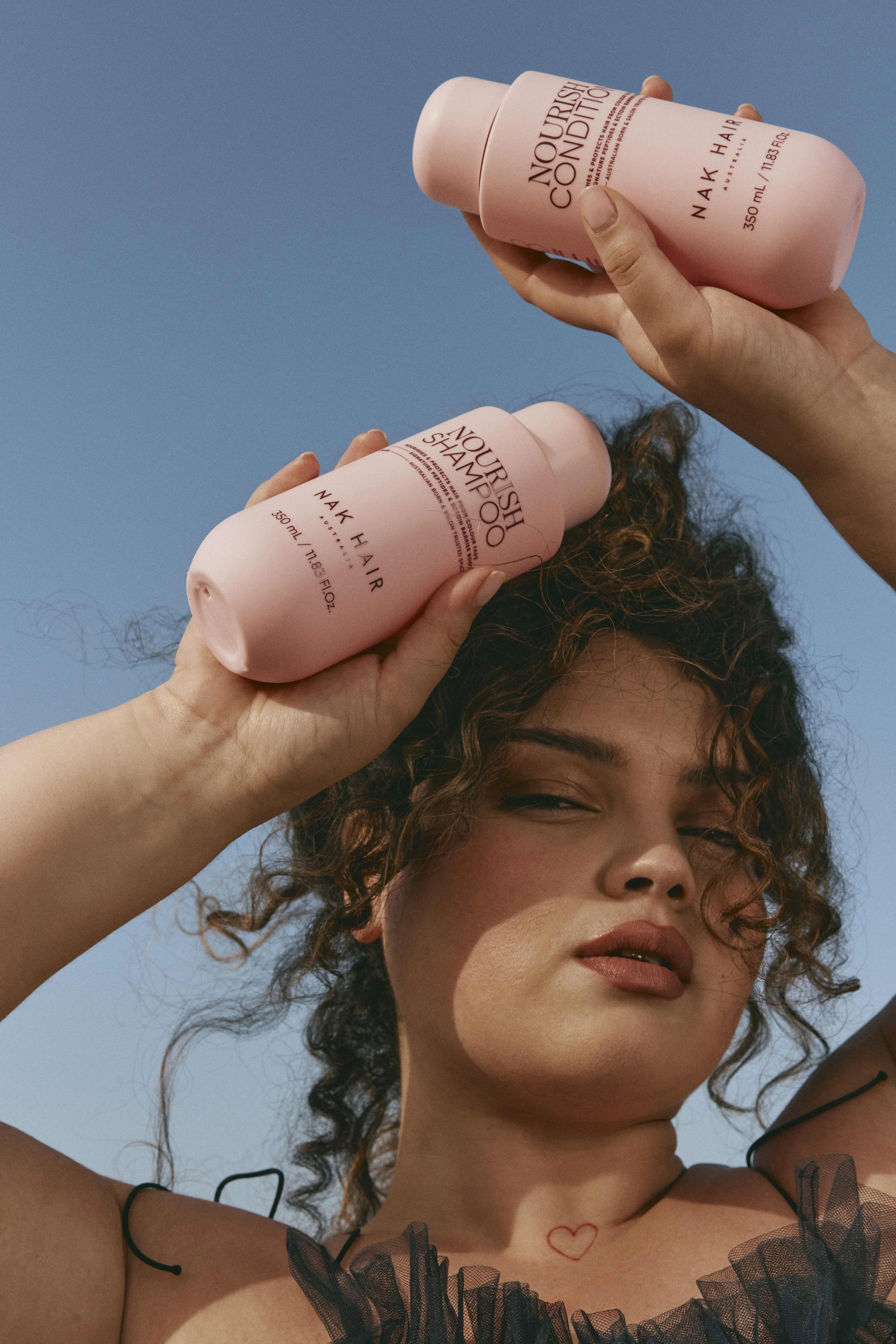
On set, I identified an opportunity to give the imagery more attitude and suggested shooting from a lower perspective, heroing the product within the frame and creating a stronger sense of scale. The resulting imagery introduced a more confident, editorial quality while keeping the product at the centre of the campaign.
.