Care - made for hair.
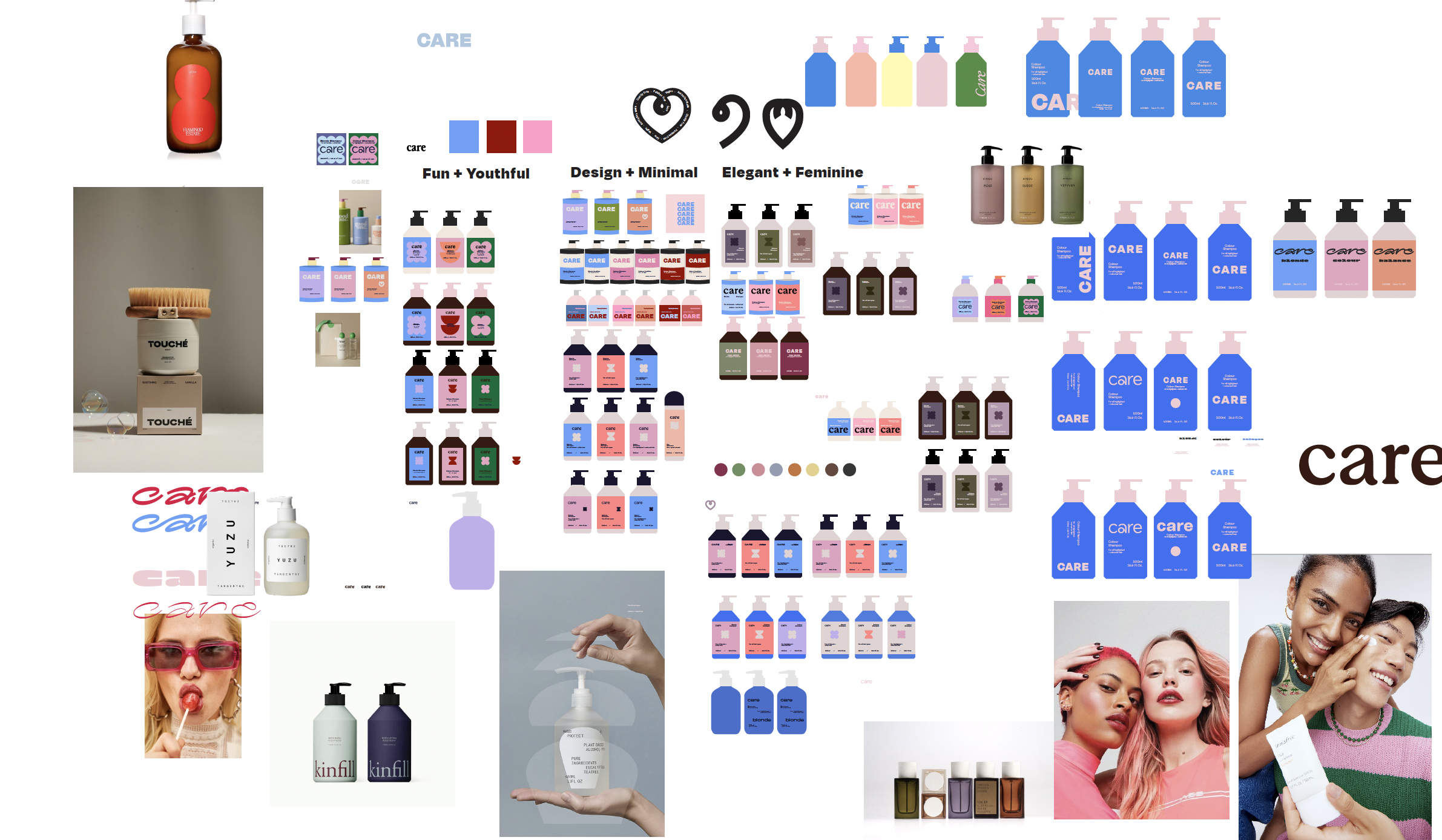
CARE is NAK Hair’s accessible, salon-quality haircare range, created to deliver high-performing, vegan formulas at an approachable price point. The original identity was highly illustrative and feminine, but as the wider NAK Hair brand evolved, CARE needed a more contemporary visual language that could stand confidently alongside the broader portfolio while retaining its own distinct personality.
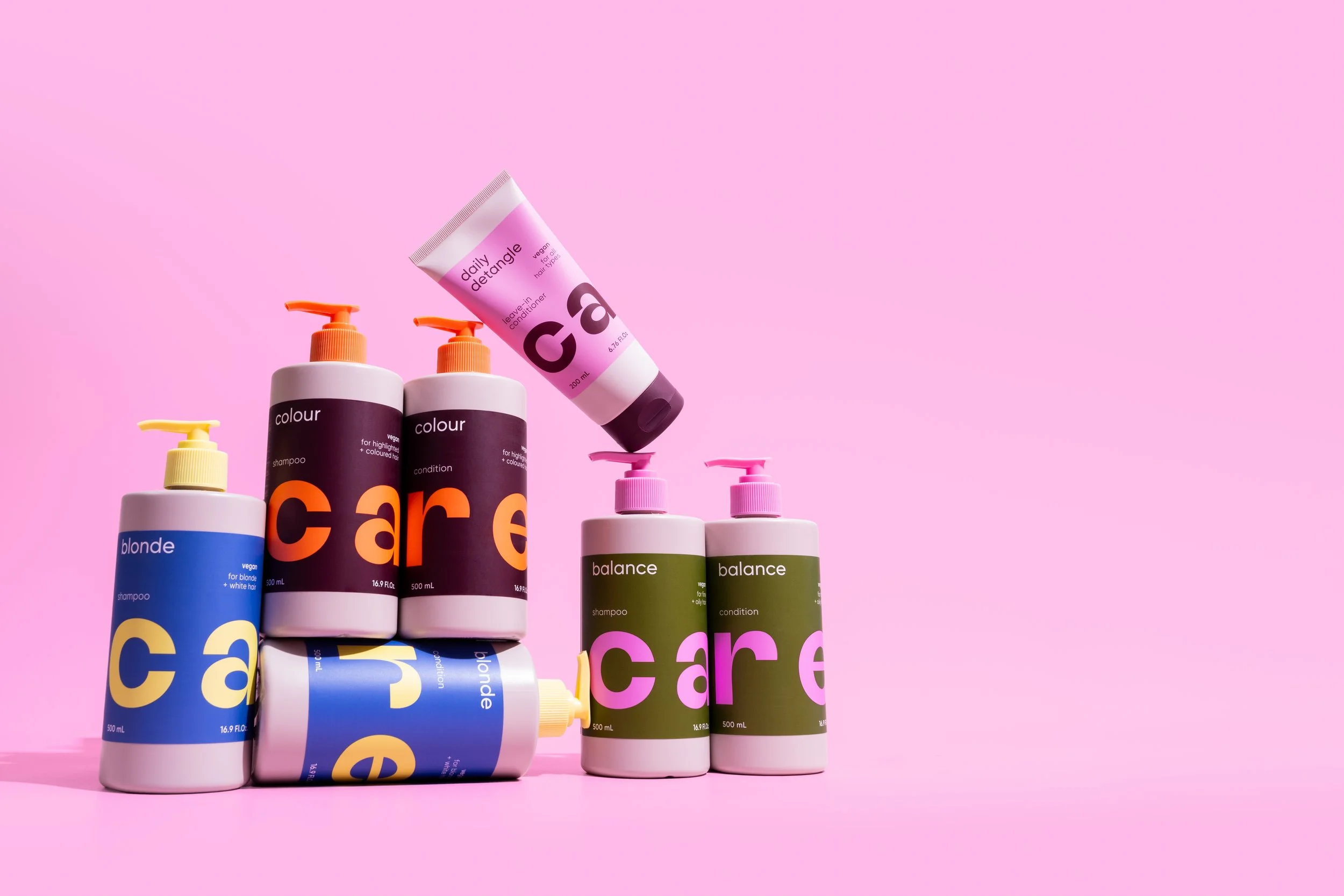
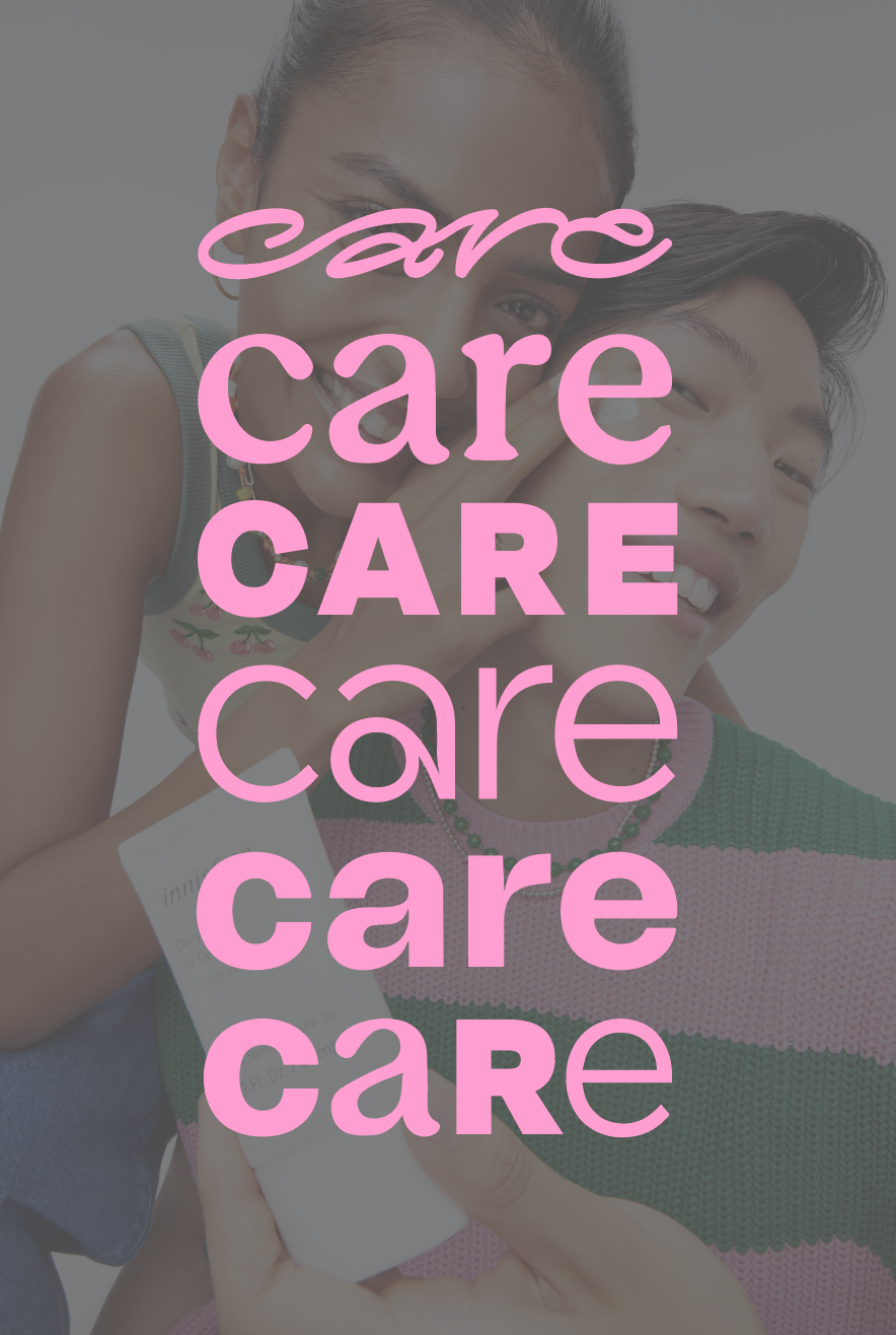
I worked on the redesign of the CARE brand and packaging, transforming the range with a bold, typography-led identity, simplified packaging architecture and a more playful approach to colour. Oversized type became a defining graphic device across the range, while individual colour combinations were developed to create clear differentiation between product families and improve recognition on shelf.
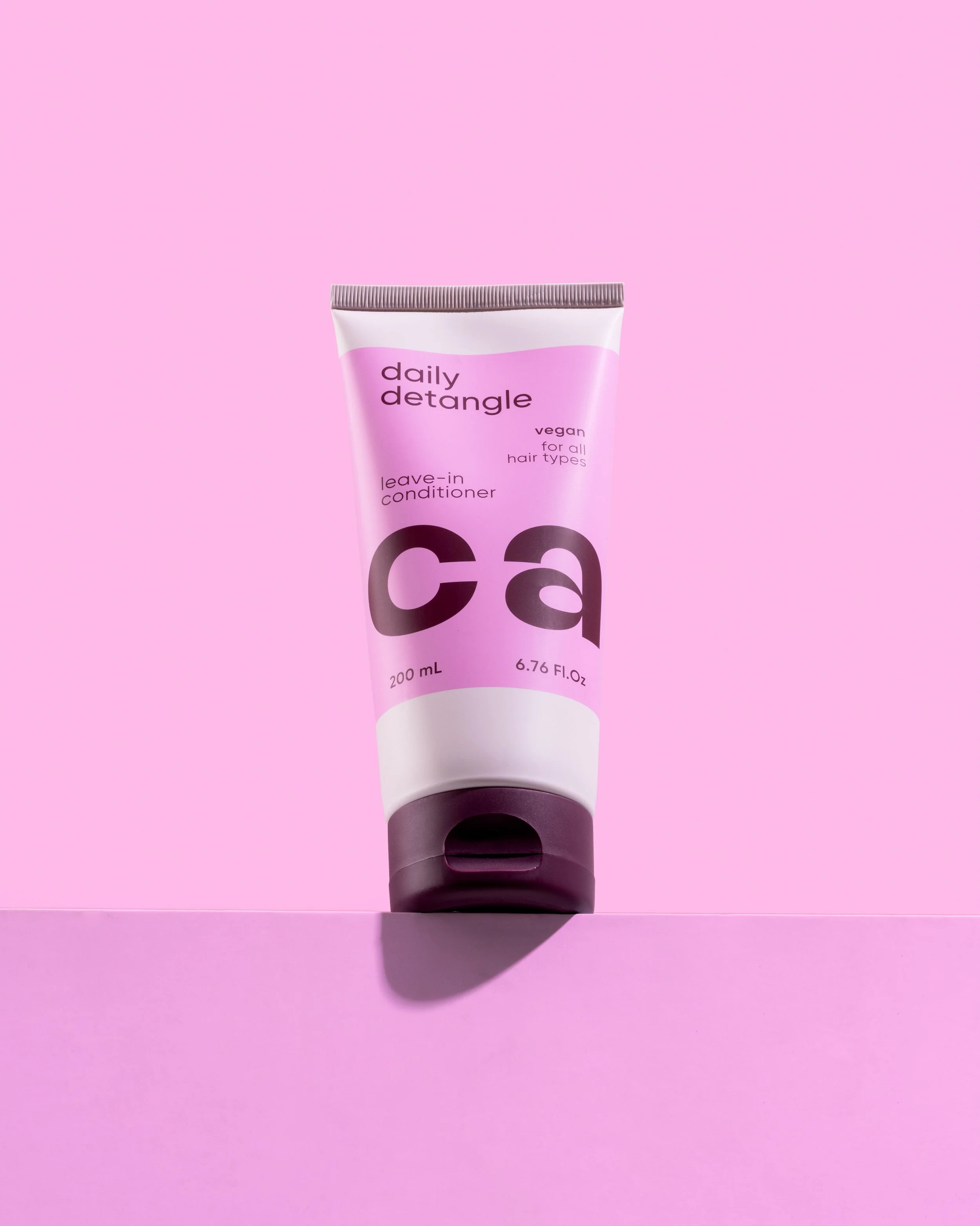
The redesign extended across the full CARE range, including shampoos, conditioners and treatments, as well as the larger one-litre format. Particular consideration was given to how the identity translated across different packaging structures and sizes, creating a system that remained visually consistent while accommodating varying product information and functional requirements.
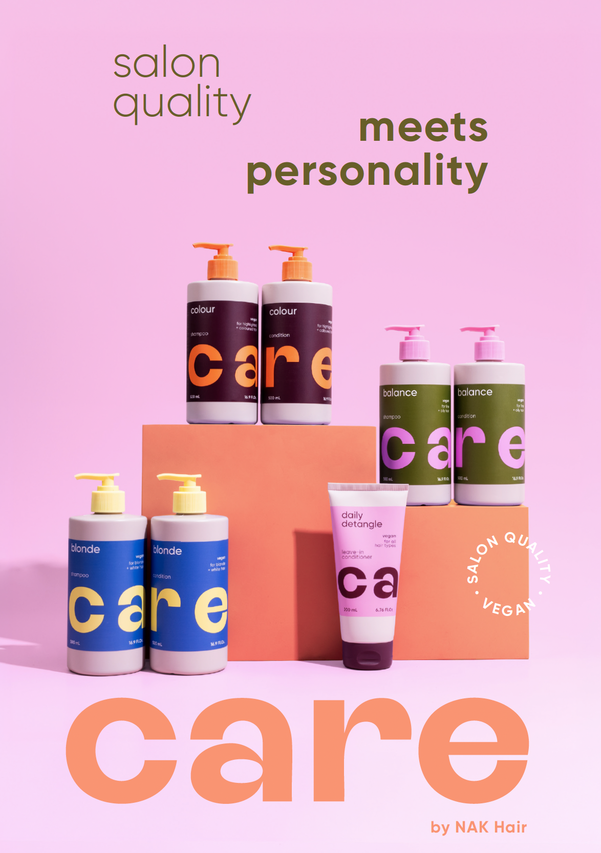
Alongside the packaging redesign, I developed supporting brand and launch collateral to introduce the refreshed CARE identity and communicate the transition from old to new packaging. This included product education, sales materials and visual communications designed to clearly articulate the new range architecture while reassuring customers that the formulas, performance and accessible price positioning remained unchanged.
The result is a more confident and contemporary expression of CARE: playful, approachable and highly recognisable, with a flexible visual system designed to create stronger impact both individually and as a complete range.